How I changed the app's main page
Vahagn Karamyan
Industry
Software Development
Role
Product Designer
About
Mimo Bike
Intro
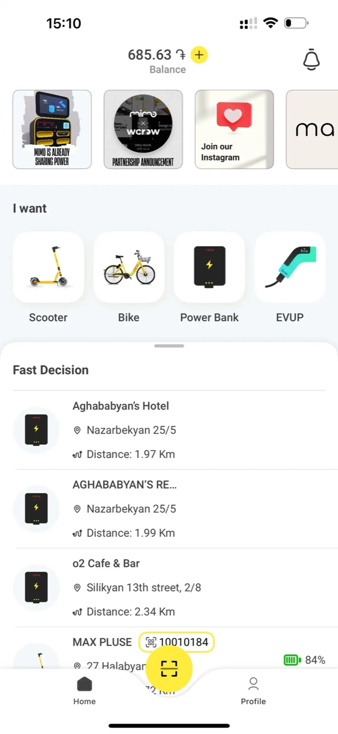
MIMO is a micromobility application that brings together scooters, bikes, power banks, and EV chargers into one platform. The goal was to design a unified experience where users can quickly find and use the nearest available product — without unnecessary navigation or confusion.
Problem
As MIMO grew and added new services (scooters, bikes, power banks, EV charging), the home screen became overloaded and required structural redesign. Users had to make several clicks to reach the product they needed, which slowed down interactions and made future scaling of the interface difficult.
Solution
I redesigned the home screen by introducing the FastDecision section — a quick-access feature that instantly displays nearby products by category: scooters, bikes, power banks, and EVUP stations.
Users can now see all available options and their distances right on the main screen, without switching to other pages or the map. This significantly reduced the number of clicks, simplified the user journey, and made the interface flexible for adding future categories without changing the core structure.
Summary
After launching the new home experience with FastDecision, users began using it as their main navigation method instead of opening individual product pages. It improved engagement and reduced the time to start a ride. The redesign made the interface cleaner, faster, and more scalable — ready for MIMO’s next growth stage.