The new "hero section" transformed the first impression of the website
Vahagn Karamyan
Industry
EdTech
Role
Product Designer
Intro
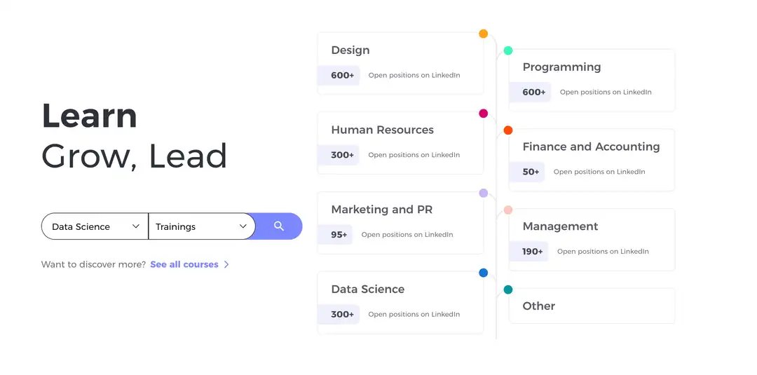
This project was focused on redesigning the Hero Section of a learning platform (BDG.am) where people can study modern professional skills from design and product management to marketing and other creative fields. The main goal was to make the first screen not only visually appealing but also more informative and actionable for users arriving on the homepage.
Problem
The original hero section looked clean but lacked clarity and interaction. The right side of the screen was reserved for a static visual, which didn’t add real value to the user experience. As the platform expanded with more courses and categories, the homepage needed to communicate the diversity of professions and help users discover relevant learning paths faster without having to scroll or search manually.
Solution
We redesigned the hero section to combine visual appeal with functionality. On the right side, we introduced an interactive visual panel that dynamically showcased different professional categories such as Design, Product Management, and Marketing along with the approximate number of open job opportunities in each field.
This way, users could instantly see which professions were trending and directly click on any category to explore available lessons and programs. The new hero not only looked more engaging but also provided real, data-driven context that encouraged exploration and interaction.
Summary
The new hero section transformed the first impression of the website from static and decorative to informative and clickable. Users began interacting with the professions directly from the homepage, leading to increased engagement and better navigation flow. The redesign successfully merged storytelling, usability, and functionality into one clear visual experience.